Enhancing the shopping experience with modern design
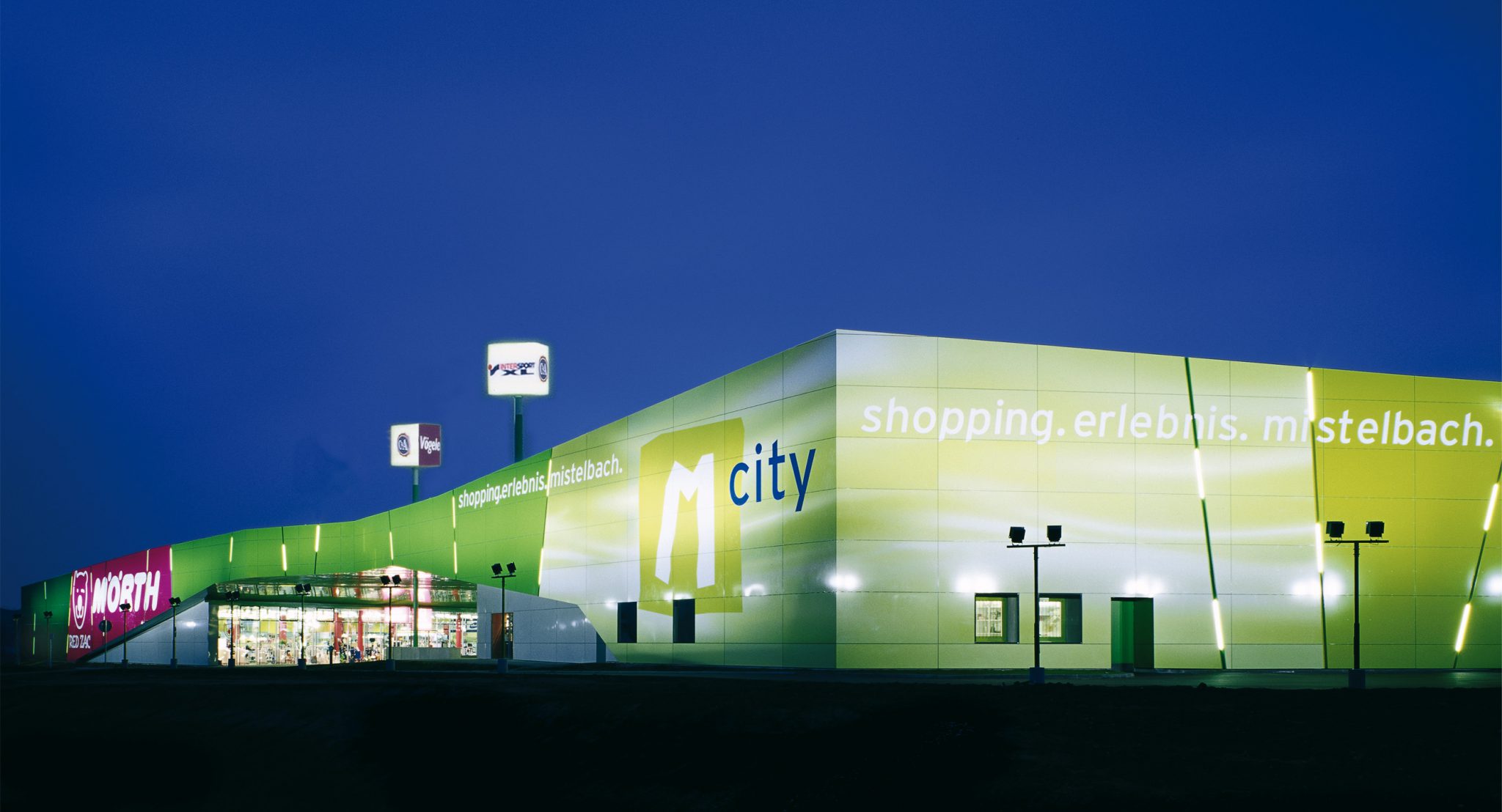
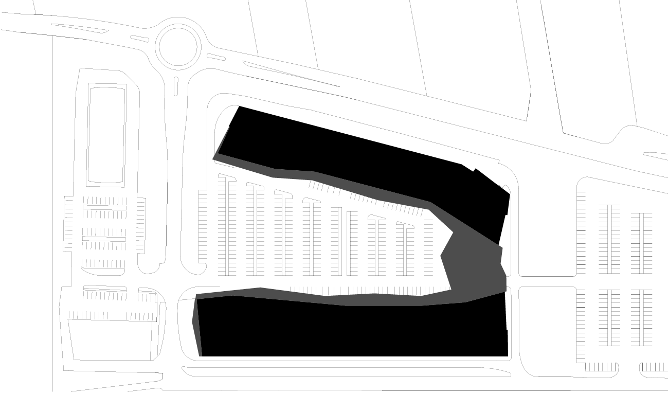
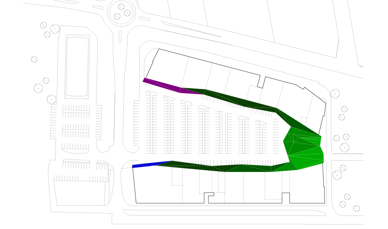
An M-shaped retail centre with a dazzling green facade has quickly become a local attraction and a landmark of Mistelbach. The location of the centre in an open field area at the outskirts of the city has greatly influenced the design concept. BEHF Architects has developed an M-shaped plan as a pillar to hold the visual identity of the building based on the marketing idea “Miteinander in Mistelbach” (“Together in Mistelbach”). Leveraging the green colour in the exterior, the architects have created a unique expression of the M-City, making the complex look like a green oasis in a rather empty landscape outside the city centre.
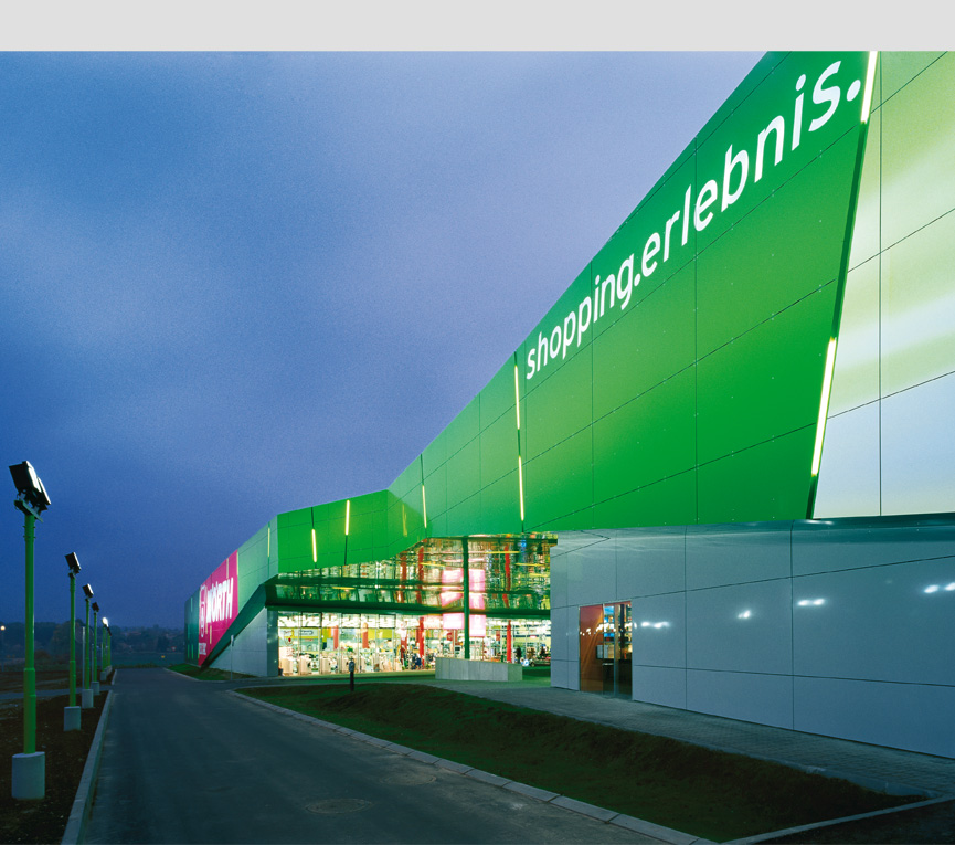
Foto © Alexander Eugen Koller
Two building blocks extend linearly over the property from west to east. They are connected via spacious canopy which provides weather protection for the Piazza formed in the intersection. With approximately 14,700 square metres and over 20 inviting stores, the centre offers a unique and inspiring shopping experience for the city. The design language of the interior emphasises the functionality of the building through clearly structured stores and simultaneously supports the sales strategies. The visitors can effortlessly move through the centre and view the products.
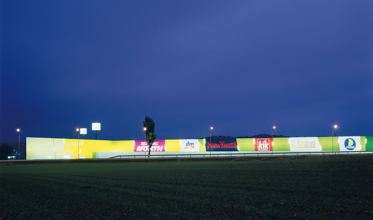
Foto © Alexander Eugen Koller
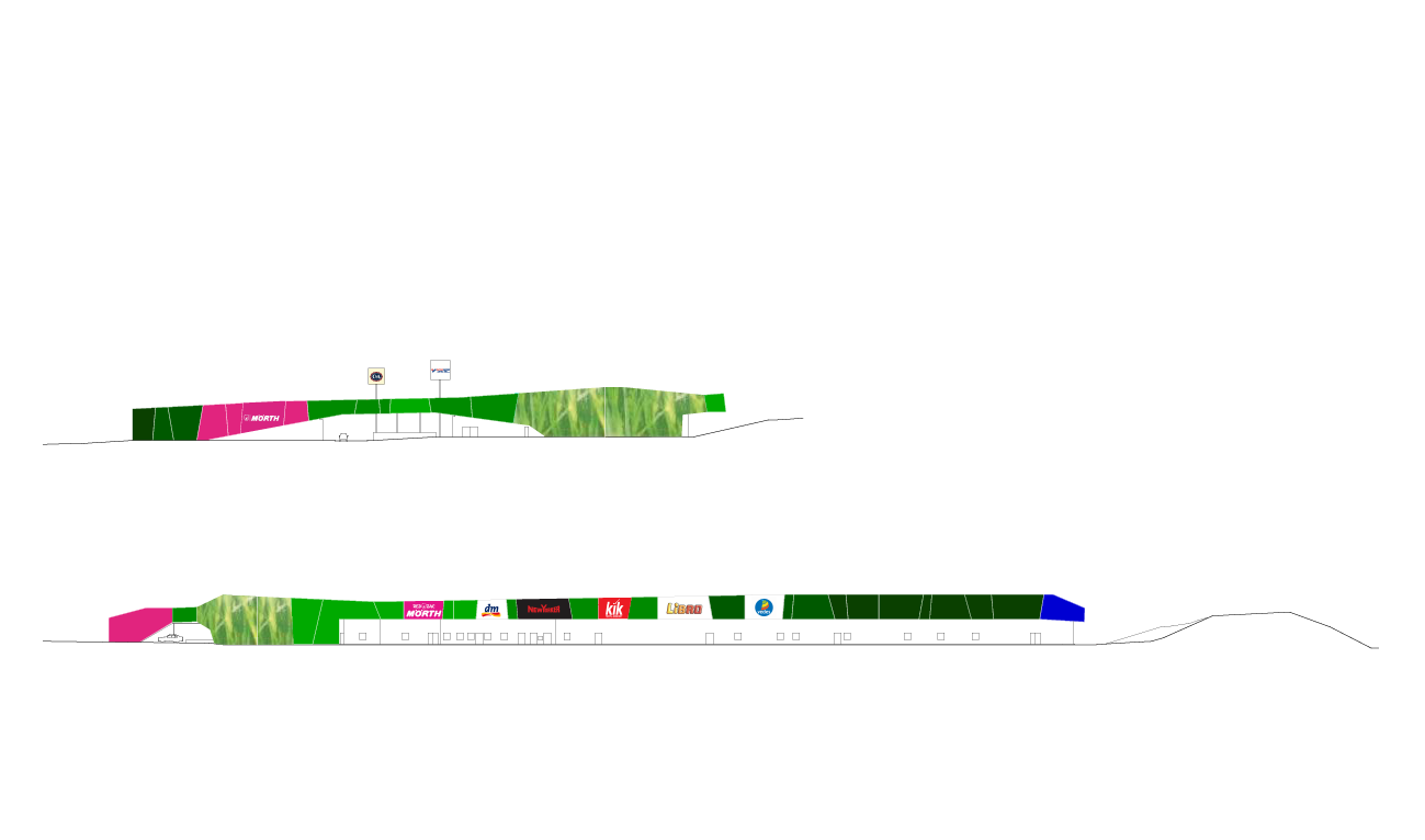
The look of the centre intentionally contradicts the traditional “decorated shed” typical in buildings in this type. Vibrant advertisements set to expire are placed directly on the facade of the building blocks. The guiding idea has been to integrate all retail advertisements into the facade of the building in order to ensure that the appearance of the centre will stay consistent over time. Large surfaces of the facade simultaneously guarantee greater visibility of the advertisements and add to the effect.
BEHF’s innovative approach to the design has resulted in an inviting ambience and a unique expression of the M-City.
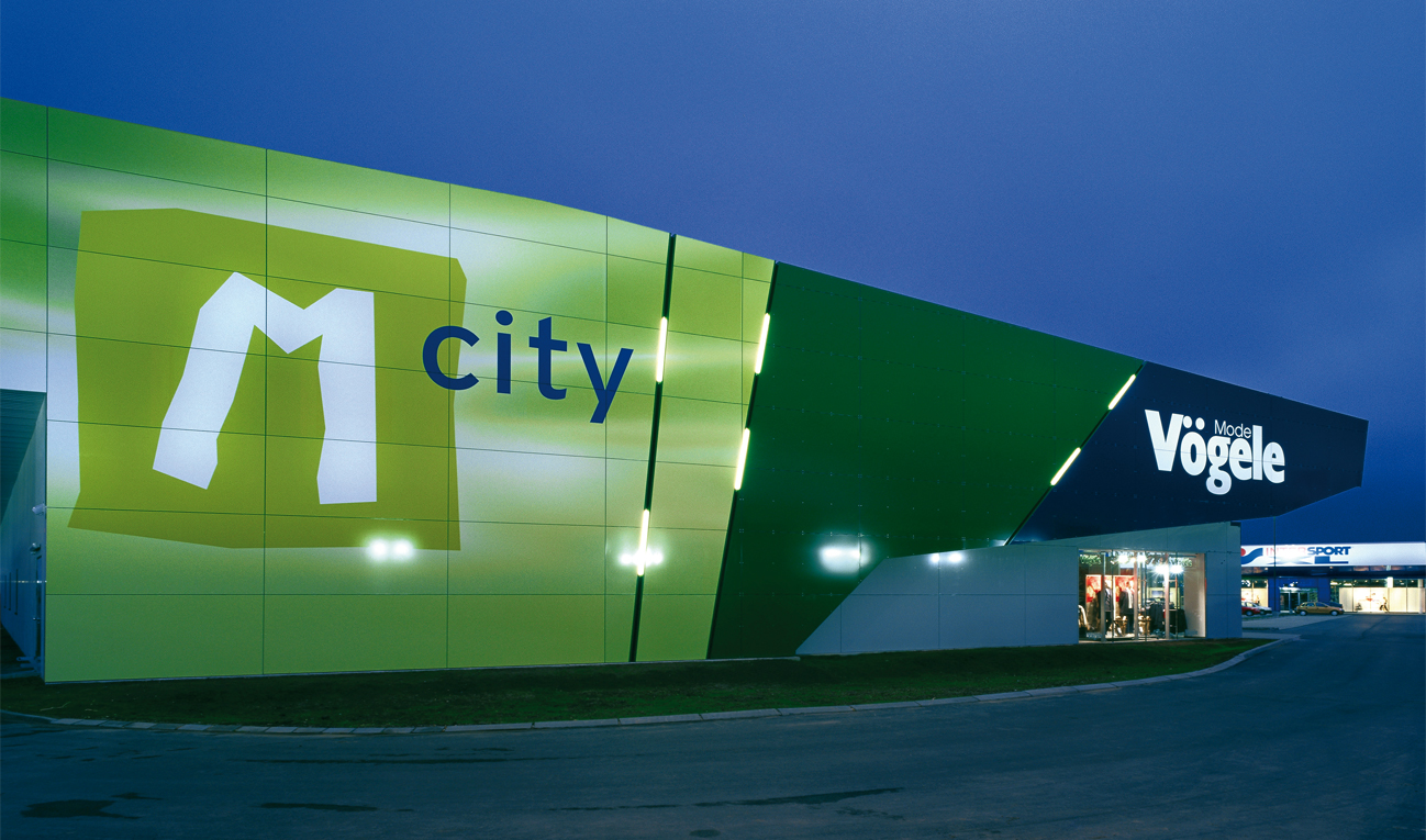
Foto © Alexander Eugen Koller
